February 2005 Archives
Over the weekend I started a new project, building a widescreen projector and it's accompanying screen. Hopefully I'll be done with the project in a couple weeks! I've currently got most of the parts on order, and should have them by the end of the week.
Not in the film sense (the atmosphere of the bar was gritty and evil), but in the natural sense (the atmosphere in the area looks bad because of pollution).
Even though as compositors we work on a 2D image, we try to convey three dimensions through tricks to fool the eye. Some compositing packages allow for creating the visuals in true 3D, like flame* or Nuke.
A tip to compositing shots that deal with extreme environments is to look at the depth of the image. When you look out across the plains, into the mountains, across the bays, you'll find that as you look farther away, everything becomes smaller, more desaturated, maybe foggier. Depth, atmosphere, and perspective all play a role in creating the scene. These ideals must be carried over when recreating a visual in the computer. Matte painters deal with this all the time; making things look far away by altering the perspective lines, desaturating the picture. As always, reality is your best reference. So get outside and check it out.
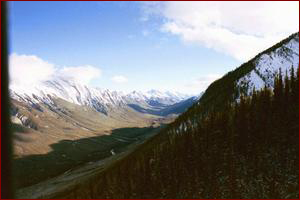
You can simulate this reality by adding atmosphere to your scene. Several different methods are available, and it all depends on your timeframe and resources. A very quick way of adding atmosphere is to throw a ramp from black to white on your image, skewed so the white end is further away from you. By desaturating the original image through this black and white ramped mask, you will see that the further away your image is, the less saturated it becomes. Adding a slight haze over this image can be accomplished by mixing in a little blue into the black/white ramp, and layering that over the image again.
You can break this down even further, by using Z-depth renders from your 3D package. If your composite is completely 2D in nature, you can try creating roto to separate the farther reaches of the shot.
Today was my last class of six on Technical Directing (TD) and Renderman training here at Tippett. Over the past six days I've learned the pipeline and set up and rendered an old training shot. During this time I've also started to get involved in the Python scripting language, which is great!
Python is a programming language, which we use to write our scripts to help our workflow. And of course, Renderman is a product of Pixar, which we use to create our images.
I'm not sure if I'm planning on becoming a TD full-time, but it is always good to know more about the processes involved in creating images for the screen! One thing which is keeping me away from becoming a TD is the extremely long render times for images. You are, after all, rendering something from nothing. Compositing is basically A over B, with a little (or a lot) of C through Z! It is much faster to composite than it is to light and render. I guess you could call TDs lighting and rendering artists.
After doing the first several tutorials of Python, I feel comfortable getting around the language, but there is still much to learn! It takes me back to when I was studying AP Comp Sci back in high school. Except we were studying Fortran, or Pascal, or Turbo Pascal, or something. I don't even think we touched on C.
I got a chance to see this eagerly anticipated film today. After the build up that I've given myself, was it worth the wait? What did they change in the cutting room? How did the music fit in with the mood of the film? Read more only if you've seen the film, or can stand to read spoilers!
Also, check out this thread at VFXTalk to ask the compositing leads your questions about the film!
The past weeks I've discussed 2D compositing tips and tricks. During the next several weeks I will start going into 3D compositing tips, which you may encounter in your work.
As a general overview, your job as a compositor is to integrate a variety of 2D elements and photographic plates into one seamless composite that appears to be shot at once, in camera. These 2D elements can range from steam and smoke, to large vistas and basic bluescreen and greenscreens. What happens when you're given several different layers of 3D rendered elements? How do you integrate these into a 2D composite? While some packages allow you to build your comp in three dimensions, we still project our finished images on a 2D surface, mainly a film or TV screen.
Your goal here is to visualize the screen in front of you in 3D dimensions. This can be made even harder since your 3D elements are in on a 2D plane! You have to visualize the depth (Z-depth) of the image. Most current image formats comprise of five channels; red, green, blue, alpha, and Z. Depending on the file format, some of them may omit the alpha and Z channels. Pick up a book on image formats to learn more about which channels each file format can hold.
The Z depth channel will hold a grayscale version of the objects in your image. Depending on the encoding, closer objects will be black, while futher objects will be white. In essence, the grayscale image will look like all the objects are in fog.
Some compositing packages allow easier tweaking of the Z channel. Combustion uses 3DS MAX's rpf file format to accurately layer different 3D renders in comp, necessitating only the rerender of one 3D render if something goes wrong. In other packages, we can use the Z depth channel as an alpha, and effectively mask certain areas of the image that we know are behind an object.
A sweet Constantine VR movie over at Meyemind. Check it out! Courtesy of the offical US Constantine website.
A whole slew of Constantine reviews have come out, some good, some bad.. Here's one from FilmForce. There's also an interview with Rachel Weisz on their front page.
Today we had our first set of dailies for our next film, Charlotte's Web. While I won't discuss what we viewed (it was mostly internal work being developed for the show), I have to say that it definitely blows previous generations of fur shading and animal animation out of the water. The shaders, painters, animators and lighters are true magicians, able to capture the subtle nuances of an animal! If you thought Ray and Carl from the Blockbuster commercials were great, wait until you see the furry critters when Charlotte's Web comes out!
The writers for this film have previous writing credits on films like The Hitchhiker's Guide to the Galaxy, Chicken Run, James and the Giant Peach, 28 Days, Ever After, and more, so this would seem like a good sign. And of course, Danny Elfman is composing!
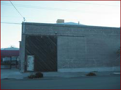
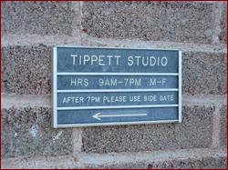
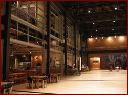
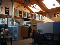
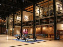
As per your requests, some inside shots of both Tippett and Pixar. Remember that Tippett is not publicly traded and has less than 200 employees. Pixar is publicly traded, and has over 500 employees.
| Tippett Studio | Pixar Animation Studios |
|
 |
 |
 |
 |
 |
Yesterday I went to an advanced screening of the film Son of the Mask, which stars Jamie Kennedy of such unforgettable films like Harold and Kumar go to White Castle, and Malibu's Most Wanted. Despite some great visual effects work from certain companies, nothing else can redeem this hundred million dollar flop.
One hundred million, you say? Yes, I do say. This is a PG rated movie, and while there were several children in the audience, I don't recall any of them laughing at the right moments. Many of us cringed in agony at some of the antics on screen. Did they really expect to pull off another Mask? Leave well enough alone. Jim Carrey was good enough to pull that film out of the gutter where it could have landed.
I would definitely skip this movie. Even if you have kids, it's better to just watch reruns of Finding Nemo or A Bug's Life. Maybe they'll figure out next time that making babies dance in the most freakish way possible is not the way to get an audience into a theatre. Ugh. I would have had more fun spending 90 minutes watching grass grow.
It's getting a little late, after a bunch of crazy shenanigans last night (which I'll discuss in a different post). Today I'm going to go into a little bit more detail with a bluescreen key, using our actor, a wonderful cat!
For all those that connect to this site wirelessly (whom I can count on one hand!), I've added a PDA access link on the sidebar.. You can also get to it directly at http://www.digitalgypsy.com/vfxlog/pda.php. It is the main page, toned down in content to fit a 480 pixel wide screen, as well as the Bio and Filmography sections of this website scaled to fit the same resolution.
Why did I do this, do you ask? Well, for one I have a PDA now, and for two, it looks like the future will be to connect to any website, whenever you want. Be it through a phone browser or a PDA browser. I've based the screen resolution on the highest maximum resolution in landscape mode for a PDA device, 480 pixels. Some of the newer iPaqs may be wider, but I haven't tested this website with those PDAs.
Received this link from a co-worker, which shows the end credits for Constantine. It looks like Tippett is the lead house on the show! Quite cool! And there's me on the top of page 14!
You'll notice that the Tippett crew credits are long and extensive, while the ESC crew credits, which follows ours, are much simpler and are lumped together. It seems the rest of the companies are lumped together as well, without regard to exactly who did what. I'm not sure why this is, or even if it will appear on screen this way. Some recurring names occur between the Tippett and ESC as well!
There are nine days left until the show premieres in North America. I'm pretty sure that we'll get an advance screening, but when, I don't know.

